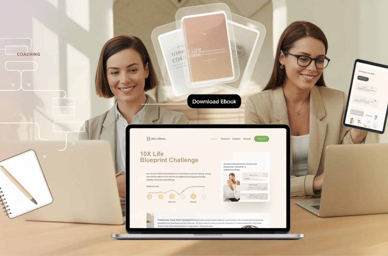
First impressions are everything. That is why a website homepage and your online course landing page must be stunning in content, context, and visuals. The high-converting landing page be it the homepage of your website or the page for your online course, is the page that describes your course. Additionally, it also persuades the audience to enrol in it.
These are the pages that your prospective students visit before deciding to sign up – or not sign up – for your course. Since a website’s home page gets the maximum site traffic, it is critical to have the elements in place to convert maximum traffic from the site. So with that, here are our nine critical elements that every website homepage must have to ensure success in your knowledge entrepreneurship.
3 things that you absolutely must keep in mind before you start writing the landing page content:
The purpose of a landing page is to influence someone to make a decision
Keep that in mind while jotting down the text for your website. Think of yourself as a salesperson, and make sure your text is like an ad.
The landing page is the Ad
As mentioned above, the sole purpose of an effective landing page is to ensure traffic arrives, stays, and performs the action you need it to. Your writing style for this text must be just like an ad copywriter, and ensure it sounds attractive enough for your audience. So while writing the text for your landing page, think about the following:
- what does your online course do for students,
- who is it for, how will it help,
- why is it better than everyone else’s, and most importantly
- why should students care enough to purchase it?
Once you answer these questions with confidence, you will be on a great start already.
Sell Online Courses 24×7 With High Performing Landing Pages. Discover How To Build A Landing Page That Converts Well. Access The Free Masterclass Here: High Selling Landing Page Design
Types of online course website landing pages:
Remember that no format is good or bad; it depends on what you feel suits your online course and your writing abilities. Primarily there are three types of landing pages specifically for online classes:
- Long-form Text-based landing page
- Text & Video Landing Page
- Video-only landing page
While the structure of the page & its content is equally important, it all depends on what you can execute well. Some course authors are great writers and have no problems writing a long-form text-based landing page, while others have great videos. Excellent execution is key here.
9 critical elements that a website homepage must have:
- Taglines that make promises and demand attention
- Opening Paragraph: Text that persuades and promises to deliver
- Benefits of your online course
- Clear & Concise Call To Action Buttons
- Course creators’ credentials
- Discounts, offers, promotional content
- Testimonials – Students, Peers
- Frequently Asked Questions
- Pricing details
- Turn off the Menu
Tagline
A great tagline is a great way to ensure your audience understands your proposition and buys into what you are selling. The copy is the basis on which a successful landing page is created. Do keep in mind that the Tagline needs to be concise yet needs to be worded carefully to ensure that it appeals to the reader instantly.
Opening Paragraph: Text that persuades and promises to deliver
The opening paragraph you create has to share clear information about the course or the enterprise, and how the online enterprise aims to make a difference for the prospective customer. Most importantly, it should show how the knowledge gained will help the participant in getting them closer to their goals.
Benefits from your online course
Why should one purchase your online course when so many are out there? That’s why it’s critical to ensure students get the information immediately. Additionally, the longer a person stays on your website, the better your search engine ranking will be. But more importantly, the prospect who is visiting your site must understand in the very first go why your online course is the best for them.
Clear & Concise Call To Action Statements and Buttons
The easy availability of call-to-action statements across the strong landing page ensures your prospects can sign in and make purchases without needing to search for them. You can increase sales exponentially by making it easy for candidates to sign up with clear Call to Action (CTA) buttons. Research shows that sales volumes are relatively higher where CTA buttons are spread across the site landing page rather than just one at the bottom.
The goal here should be that these CTA buttons and statements should be spread across the page so that users can click on the Sign-Up or buy now button and purchase from you without searching for that button.
Make sure to spread the CTA Buttons across the page so that users can find them without scrolling up or down the page searching for them.
Course creators’ credentials
While anyone can launch an online course ideas, students always prefer course authors who have some credibility in the field. It may not necessarily be academic or professional. You can always share your credibility based on your experience in the domain and successes and achievements in the field related to the course topic.
So if it’s a course about better childcare or new motherhood, your experience in bringing up your child can be quite a credential for a student versus someone who only has bookish knowledge, for example. However, one thing remains clear. Course author credentials are necessary to establish the course’s credibility.
Discounts, offers, promotional content
Limited period offers discount coupons, early bird offers, free giveaways, etc. You can create various promotions on your online course that would entice the site’s audience to share their email IDs or sign up for the course. With free giveaways, you can capture an email ID that allows you to re-market to these specific prospects, and sign-ups would lead to more sales—a win-win in either case.
Testimonials
Testimonials are always great to show that your online course is worth it. These could be from peers talking about your expertise in the subject matter, students trained earlier, or, if available testimonials from potential learners who have taken up the course. Text-based testimonials are acceptable for use. However, video-based testimonials have great value as they are a touch of authenticity. Whatever the case may be, your online enterprise must have testimonials.
Frequently Asked Questions
Automate processes and reduce the burden of manually answering questions. Create a strong list of questions that students might ask. Preempting the questions would greatly enhance the experience of a prospect since most of their doubts or concerns would have been answered automatically.
Pricing details
An absolute must. You need to ensure that from the get-go, your prospective students know how much your online course costs. Ideally, this is taken care of near the CTA (call to action) buttons. Offering different price tiers is a great way to increase your course sales. So you could always consider offering a free course as a sample, a mini-course at 40 – 50% cost, and a full-fledged course at the full price. This will increase your sales and revenues and give you a clear idea of your customer’s stage in the purchase journey and hence focus your strategies accordingly.
Knorish Pro Tip: If you run ads on your site without a landing page, you will end up losing money and will not get any sales. Because users will come to your site, and click on the different pages listed on the menu, and will get lost in the site eventually.
So to get the most conversions out of your landing page, turn the menu off on the landing pages. Because when you run ads and drive traffic to the page, users can only click on the CTA buttons and sign up or leave the site. This would immediately increase the sales numbers on your site.
Learn how to convert your course page to a landing page – How to switch off the menu on a landing page
Final Thoughts:
For success in your knowledge venture, ensure that these points are incorporated but make sure that when you run ads to bring traffic to your site, TURN OFF THE MENU. Turning off the menu ensures that the visitor stays on the page and performs only the action you wish them to rather than getting lost on the site.
Lastly, the best advice we can give is to get inspired. Visit other landing pages such as those of your competitors and honestly check – would you buy from this person or company? If yes, what do you like, and if not – what’s stopping you? Based on this experience, try to put together your landing page. Take inspiration and look at your competitors from a constructive point of view – how can I do better?


