The time to launch an online course has never been better. As per a recent report, the global online course industry will be worth $331 Billion by 2025. It’s no wonder that across the world, thousands have already launched courses across platforms and are making billions in the process. If you plan to launch an online course for your enterprise, one of the most important things you can do is create a landing page. A landing page is the first page that a prospect views. Whether you plan to launch a single course or an entire enterprise with a host of courses, a high-converting landing page is vital to selling well.
Time and again, knowledge entrepreneurs who have launched courses on Knorish have asked the same question: How do you create a landing page that increases sales and helps mitigate any doubts that prospective clients may have?
How to create the perfect landing page for your online academy?
Sell Online Courses 24×7 With High Performing Landing Pages. Discover How To Build A Landing Page That Converts Well. Access The Free Masterclass Here: High Selling Landing Page Design
So here’s a comprehensive list of steps that you can copy to ensure that the landing page for your enterprise has what it takes to increase engagement and create exponential sales.
Taglines that make promises and demand attention
A great copy is the basis for creating a successful landing page. The first thing that a landing page needs are a great tagline. A tagline defines what the online course or enterprise is about and the promise it makes for the helpful content quality and expertise of the course creators.
Remember that the Tagline needs to be concise yet worded carefully to ensure that it appeals to the reader instantly. IIYM.org’s tagline is a great example.

(Image Source — iiym.org)
It’s a direct call to action tagline that very simply offers what the course is about, its result and the promise of success in the endeavour, all in just about ten words. ‘Buddha’s Eight-Fold Path To Peace & Success In Life
Do note that since this is an online academy that talks about mindfulness, peace & serenity, the language is appropriate for the audience it attracts.
Remember: Taglines can be a little short. The banner Image text is a prime estate, and every single character, letter and image are extremely important. That’s the first thing anyone who lands on your website will see.
Another knowledge entrepreneur for his thought school has used a tagline:
“Live a life of possibilities The Happiness Mantra”
Once again, though a very short tagline, the text clearly shows purpose, promise, and what the course holds for a prospective learner.
Opening Paragraph: Text that persuades and promises to deliver
Once your tagline piques the reader’s interest, the following paragraph you write has to be about the course or the enterprise, and how the online enterprise aims to make a difference for the prospective customer. Most importantly, it should show how the knowledge gained will help the participant get them closer to their goals. Even if it is clear about what the participant will get when they take up the course, it is important to clearly outline the outcomes.

In this example, the knowledge entrepreneur has shown his entrepreneurship school’s value systems and how the philosophy would be used during the course to help participants in their learning journey.
Credentials — About the Course creators
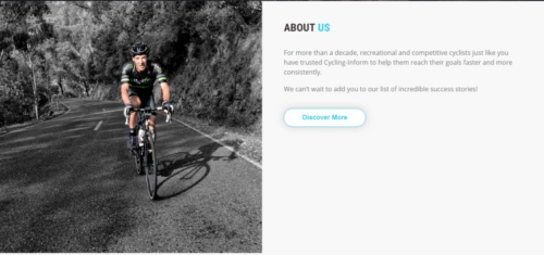
(Image Source – www.cycling-inform.com)
Whether you plan to launch the course or enterprise on your own or collaborate with others, the credentials and expertise of the course creators go a long way in establishing the authority. Experience, credentials, results achieved, note-worthy awards & recognition, and any other reason that establishes why the course creators are perfect for launching the course all play an important role in setting up your credibility. If there are many course creators, create a separate page or block highlighting all the details, including the expertise and credentials.
Vital subheadings that garner attention
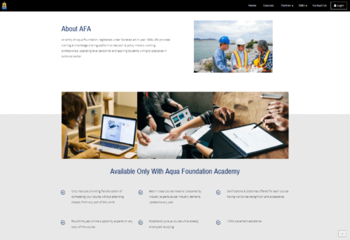
The following section could be another set of USPs only available with your course. This section is important as it directly shows that the course has benefits that directly relate to what the learners would learn and gain from. One could talk about USPs using strong headings like how the course helps in getting industry-specific jobs, the opportunity to learn from industry stalwarts, the experience of the faculty, maybe even jobs assistance assurance, whatever the benefits may be, breaking them down into highlights or subheadings. If you can showcase that the benefits are way more of value than the actual cost of the program, you would be able to sell the course a lot more.
First Call to Action

(image source – indianschoolofdesign.com)
In this section, you provide a button to the reader that will allow them to do exactly what you intend them to do. Known as the ‘Call To Action’ button, it gets the prospective client to purchase your course, sign up for an email newsletter, join your community, or whatever is the primary goal intended. It is key that the call to action must be simple, straightforward, yet concise.
With the call to action goes a list of benefits of the course, enterprise, or promise of quality customer service, whatever it may be, a call to action button must always be accompanied by associated benefits or promise of quality.
Testimonials
Testimonials are a great way of showcasing firsthand experiences. Testimonials could be of peers talking about the course creator’s expertise in the subject matter. It could also be of students trained earlier or if available, testimonials from learners who have taken up the course. Text-based testimonials are fine enough. However, video-based testimonials have great value. While text-based testimonials could be made up, video-based testimonials add a sense of reliability to the reader. If this is the first time an online course or enterprise is being launched, text or video-based testimonials could be from peers or students who have been trained by the course creators in person offline, or you could release the course to a select few to get testimonials as well. Whatever the case may be, your online enterprise must have testimonials.
Objection Handling
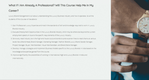
(image source – lcbs.knorish.com)
Every prospective lead has a slew of objections and doubts and requires clarifications. One of the ways to handle those is to proactively jot down a list of frequently asked questions with explanatory answers, as is the Industry practice. On the other hand, you could also find unique ways to highlight the answers to the most commonly asked questions in the main section of the page—for example, Numerology. As part of their online course, the Academy decided to highlight an FAQ on the main page.
The question is: What if I am a professional? Does the course benefit me as well?
Social Proof – Testimonials
It could be specific reports from credible sources highlighting the need for the course, the need for professionals in the industry, or even case studies from reputable sources that go a long way in establishing the credibility of the course and the experts who build the course. Statistics in terms of the requirement of professionals in the industry who have gone through your course or future job prospects do help in convincing the reader of possibilities post finishing the course. The best examples to cite on the page would be of past students who have pursued the course and done well for themselves post-course completion.
The promise of quality and great customer service support
What most knowledge entrepreneurs need to establish is reliable customer service support. Though online courses are automated, requiring almost zero customer service support, it is imperative that current customer service support channels are indicated on the page. The information should be visible, whether it is an email campaign, chat, or phone number.
Additionally, it doesn’t hurt to mention a statement of the promise of quality. Although it may sound cliche, one must remember that although online learning has become mainstream now, people still like to mitigate doubts before finally purchasing. A promise of quality, commitment, and great customer service support goes a long way in mitigating any such doubts.
The second call to action with more spread across the page
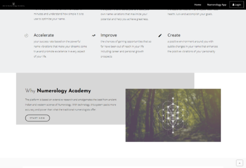
Why have only one when you can have two in place? A call to action, as described earlier, helps get clear predefined actions completed. A simple, concise, yet clear call to action helps increase sales. By now, you have shared enough reasons for a prospective lead to make a decision. This is the perfect time to reiterate the reason why they are on the page. A call to action redirects the attention toward the decision-making moment and allows the prospective lead to make a final call. All this without the need to scroll up the page to find the first call to action button, which is never a good user experience.
Knorish Pro Tip
If you run ads on your site without a landing page format, you will lose money and not get any sales. Because users will come to your site, click on the different pages listed on the menu, and eventually get lost in the site.
So to get the most conversions out of your landing page, turn the menu off on the landing pages. Because when you run ads and drive traffic to the page, users can only click on the CTA buttons and sign up or leave the site. This would immediately increase the sales numbers on your site.
Learn how to convert your course pages to a landing page, read more here: How to switch off the menu on a landing page
Here are a few examples of some of the awesome websites built with Knorish:
Final Checklist:
Whether you keep the same order or mix it all, ultimately you need to ensure to have a dedicated landing page, these 9 points need to be incorporated. Remember that the structure must address information flow based on how a potential candidate would like to see it. The best way to do that would be to ask someone who matches the persona of your potential target market to look at the landing page section by section and ask them for their opinion. Here’s a quick summary for you without the need to scroll up on the page.
- Did you switch off the menu?
- Do you have a tagline that makes a lasting impression?
- Do you have an opening paragraph explaining the benefits and persuading the reader to make a sale?
- Have you mentioned the expertise, credentials and specific skills that make them the perfect choice as course creators?
- Do you have additional subheadings/paragraphs highlighting the course’s USPs or the enterprise?
- Are you launching one course or many? If it’s a single course, mention how it would benefit all the participants. If it’s a school with many classes — showcase why one should be interested in this school. After all, repeat business is always good for business.
- First Call to Action — the reader is on your page for a reason. Call-to-action buttons help convert leads to sales.
- Do you have testimonials ready? Text or Video? Videos do better.
- Preempt questions and answer them. Look at the most important one and address it in a specific section.
- Social proof it. Use statistics, case studies, success stories, or anything that proves the scope of the course or the quality of it and why a user must take it up, that too right now.
- Promise to deliver relevant content with even better customer service support.
- A second call to action: Avoid leads searching for that buy now button while scrolling up the page. Give them an option to “BUY NOW” now by providing a second call to action button.


